1.5.7 View Student Reports
Follow these steps to understand and analyze reports in EdisonOS effectively.
What are Reports?
The Reports section in EdisonOS gives you a comprehensive view of how each student performed on any Practice Test or Problem Set. As an admin or tutor, you can drill into scores, section breakdowns, time analysis, and individual question responses all from one place.
Step 1: Navigate to Reports
From the left sidebar, select your Program (e.g., SAT).
Click on Reports in the left navigation.
At the top, you will see two tabs, Practice Test and Problem Set. Select the appropriate tab based on what you want to review.
Note: Both Practice Test and Problem Set reports are accessible from the same Reports tab. This guide uses a Practice Test as the example.
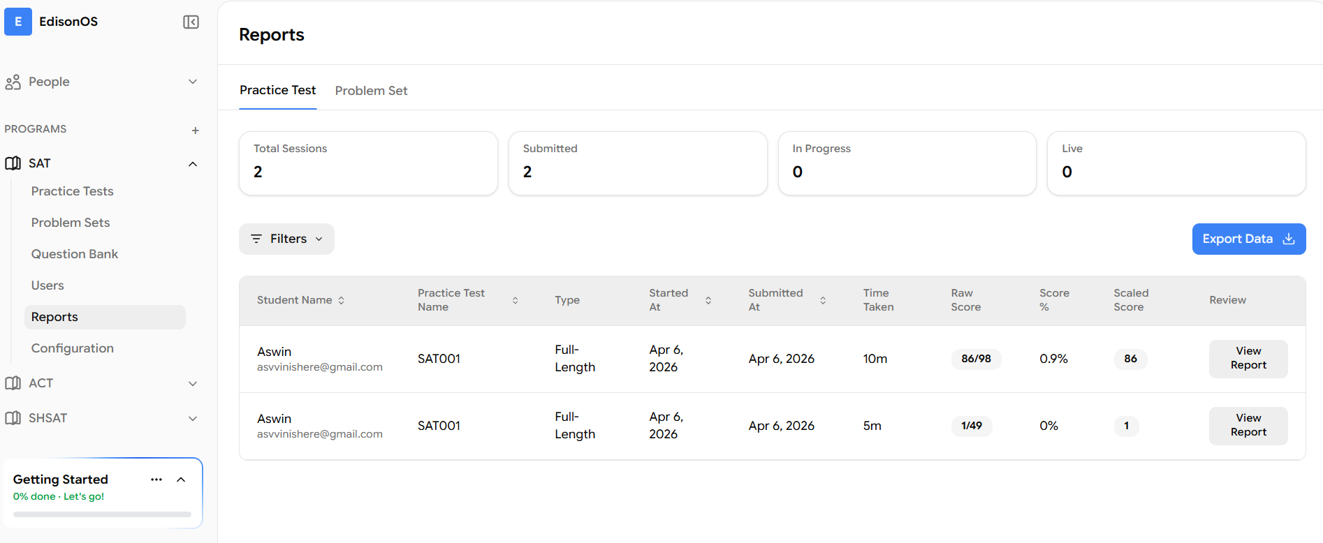
The Reports dashboard displays four summary counters at the top:
Counter | What it shows |
|---|---|
Total Sessions | Total number of test attempts across all students |
Submitted | Attempts that have been fully completed and submitted |
In Progress | Attempts currently being taken by students |
Live | Attempts currently active in real time |
Below the counters, a table lists each attempt with the following columns: Student Name, Practice Test Name, Type, Started At, Submitted At, Time Taken, Raw Score, Score %, Scaled Score, and a View Report button.
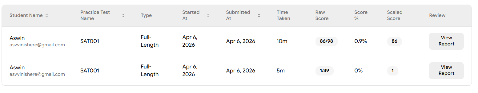
If the same test has been taken more than once by the same student, use the Started At and Submitted At columns to identify which specific attempt you want to review before clicking View Report.
Step 2: Filter Reports by Student or Status
If you have many students and need to locate a specific report quickly, use the Filters option.
Click the Filters button near the top-left of the table.
A filter dialog will appear. Click the Condition dropdown to select what you want to filter by.
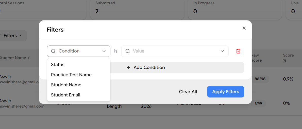
You can filter reports using any of the following conditions:
Condition | What it filters |
|---|---|
Status | Filter by Submitted, In Progress, or Live |
Practice Test Name | Search by the name of the test |
Student Name | Search by the student's name |
Student Email | Search by the student's registered email address |
After selecting a condition, type the relevant value in the Value field.
Click Apply Filters to see the matching reports.
To add more conditions, click + Add Condition and repeat the above steps.
To start over, click the Delete (trash) icon next to a condition to remove it, then click Apply Filters again.
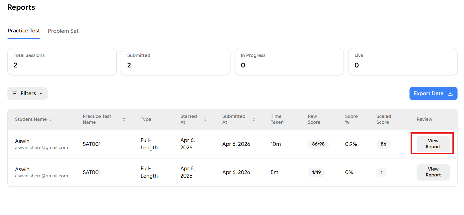
Step 3: Open a Student's Report
Once you have located the attempt you want to review, click the View Report button in that row. This opens the full student report for that specific attempt.
Now that the report is open, the next steps will guide you through the various reports and insights available in the platform.
Step 4: Overview of Score Summary
At the top of the report, you will see a header bar showing:
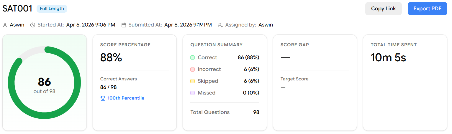
Name of the Student
Started At and Submitted At timestamps
Assigned by – the admin or tutor who assigned the test
Buttons to Copy Link (share the report) or Export PDF
Below the header, five summary cards give you an instant read on overall performance:
Card | What it shows |
|---|---|
Score (circular chart) | The total raw score (e.g., 86 out of 98) displayed as a circular progress ring |
Score Percentage | The overall percentage of correct answers (e.g., 88%), plus the fraction of correct answers and the student's percentile rank |
Question Summary | Total count of Correct, Incorrect, Skipped, and Missed questions |
Score Gap | The gap between the student's current score and their target score (if a target has been set) |
Total Time Spent | The total time the student spent on the entire test |
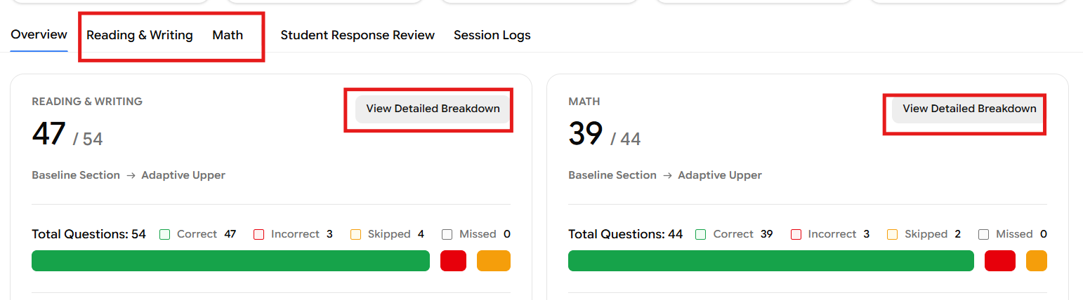
Step 5: Overview of Section Breakdown
Scrolling below the summary cards, the Overview tab displays side-by-side panels for Reading & Writing and Math.
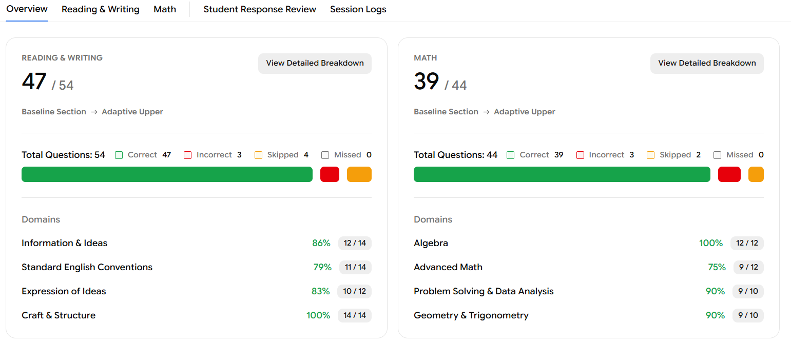
Each panel shows:
Score for that section (e.g., Reading & Writing: 47/54, Math: 39/44)
Adaptive path taken – whether the student moved from Baseline Section → Adaptive Upper or Adaptive Lower
A colour-coded progress bar broken into Correct (green), Incorrect (red), and Skipped (orange) segments
Total Questions with the count of Correct, Incorrect, Skipped, and Missed
Domains – a list of all skill domains for that section with their score percentage and fraction (e.g., Algebra: 100% - 12/12, Advanced Math: 75% - 9/12)
Each panel also has a View Detailed Breakdown button in the top-right corner. We will cover this in Step 8, you can either click that button or navigate directly using the Reading & Writing or Math tab at the top of the report.
Step 6: Answer Changes & Performance by Difficulty
Continuing to scroll down the Overview tab, you will find two more sections.
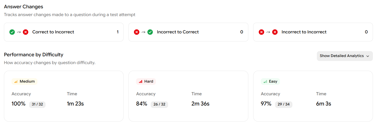
Answer Changes
This section tracks every time the student changed an answer during the test:
Metric | What it shows |
|---|---|
Correct to Incorrect | Questions the student initially answered correctly but later changed to a wrong answer |
Incorrect to Correct | Questions the student changed from wrong to right |
Incorrect to Incorrect | Questions the student changed but still got wrong |
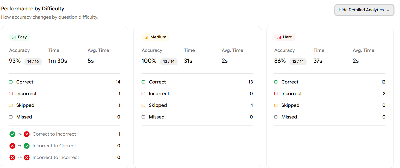
Performance by Difficulty
This section shows how the student performed across question difficulty levels which are Easy, Medium, and Hard.
Click Show Detailed Analytics (top-right of this section) to expand the full breakdown. For each difficulty level, you will see:
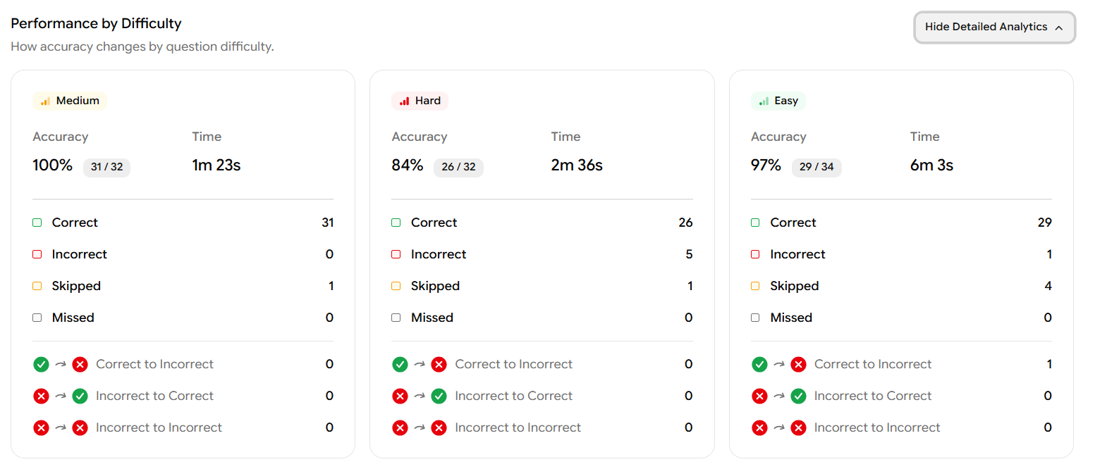
Accuracy – the percentage of correct answers for that difficulty, and the fraction (e.g., Medium: 100% - 31/32)
Time - total time spent on that difficulty group
Count of Correct, Incorrect, Skipped, and Missed questions
Answer change tracking specific to that difficulty (Correct to Incorrect, Incorrect to Correct)
Step 7: Performance by Time
The Performance by Time chart on the Overview tab shows how the time a student spends per question relates to their score.
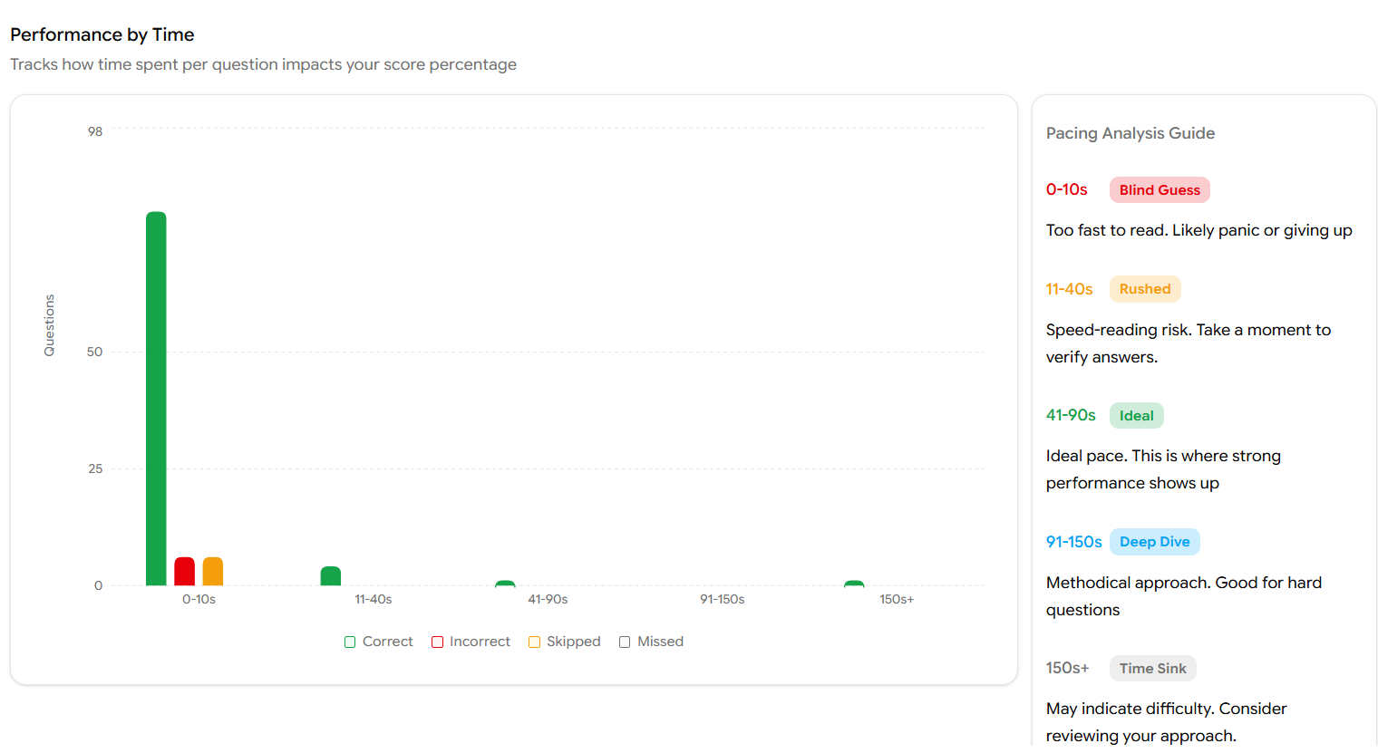
The horizontal axis represents time buckets, and the vertical axis shows how many questions fall into each bucket. Bars are colour-coded green for Correct, red for Incorrect, orange for Skipped.
Use the Pacing Analysis Guide on the right side of the chart to interpret results:
Time Range | Category | What it means |
|---|---|---|
0–10s | Blind Guess | Too fast to have read the question — likely panic or giving up |
11–40s | Rushed | Speed-reading risk; the student should slow down and verify answers |
41–90s | Ideal | The optimal pace, this is where strong performance typically shows up |
91–150s | Deep Dive | A methodical approach, good for hard questions |
150s+ | Time Sink | May indicate the student is struggling — consider reviewing their approach |
Hover over any bar in the chart to see the exact count of Correct, Incorrect, Skipped, and Missed questions for that time bucket.
Step 8: Detailed Breakdown – Math (or Reading & Writing)
To access the detailed breakdown for a section, you can either:
Click the Math or Reading & Writing tab at the top of the report, or
Click the View Detailed Breakdown button inside the respective section panel on the Overview tab
Both options take you to the same section-level report. For this example, we will walk through the Math section and the R&W section both follows the identical structure.
Section Header
At the top of the Math tab you will see:
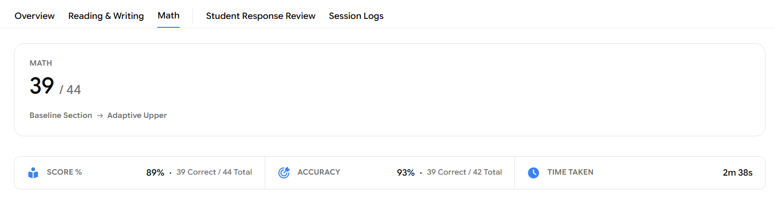
MATH: 39/44 : the total raw score for this section
Adaptive path : e.g., Baseline Section → Adaptive Upper
Performance Summary Bar
Three key metrics are displayed in a horizontal bar:
Metric | What it shows |
|---|---|
Score % | Overall score percentage for this section (e.g., 89% — 39 Correct / 44 Total) |
Accuracy | Accuracy calculated against only the attempted questions (e.g., 93% — 39 Correct / 42 Total, excluding skipped) |
Time Taken | Total time spent on this section (e.g., 2m 38s) |
Score Breakdown
Below the summary bar, the Score Breakdown panel shows performance split by section stage:
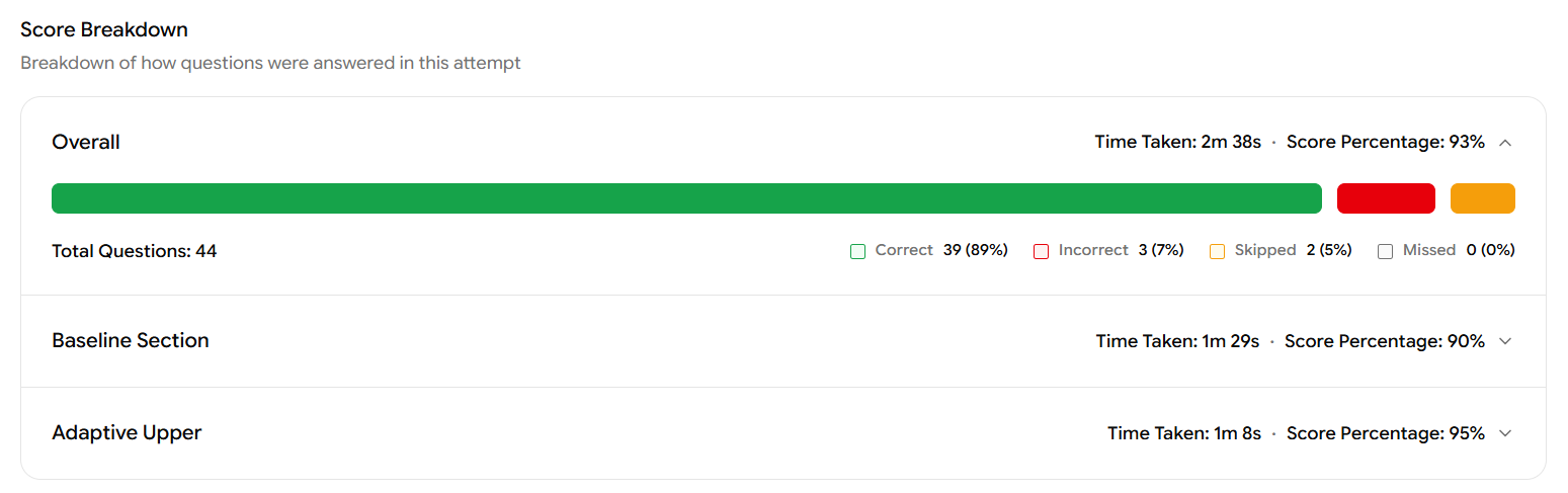
Overall – Aggregate across the full section (Time Taken, Score Percentage, progress bar)
Baseline Section – Performance on the standard first module (e.g., 90% score percentage, 1m 29s)
Adaptive Upper – Performance on the harder second module (e.g., 95% score percentage, 1m 8s)
Each row can be expanded to see the question-level breakdown within that module.
Performance by Difficulty (Math)
This is the same type of difficulty breakdown as the Overview, but now scoped specifically to the Math section:
Easy: e.g., Accuracy 93% (14/16), Time 1m 30s, Avg. Time 5s
Medium: e.g., Accuracy 100% (13/14), Time 31s, Avg. Time 2s
Hard: e.g., Accuracy 86% (12/14), Time 37s, Avg. Time 2s
Each difficulty card lists Correct, Incorrect, Skipped, and Missed counts, plus any answer changes.
Step 9: Skill-Difficulty Heatmap
Scrolling further down the Math tab, the Skill-Difficulty Heatmap lets you pinpoint exactly which domains and skills the student excels at or needs to work on.
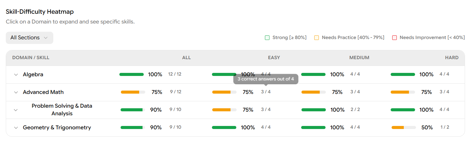
The heatmap displays every domain and skill with their accuracy across All, Easy, Medium, and Hard difficulties. Scores are colour-coded:
Colour | Range | Meaning |
|---|---|---|
🟢 Green | ≥ 80% | Strong |
🟡 Orange | 40% – 79% | Needs Practice |
🔴 Red | < 40% | Needs Improvement |
Click on any domain row (e.g., Advanced Math) to expand it and see individual skill-level scores underneath.
In the screenshot, Advanced Math shows 75% overall clicking to expand reveals three skills all sitting at 75%: Nonlinear Equations in One Variable & Systems of Equations in Two Variables, Nonlinear Functions, and Equivalent Expressions. These are the specific skills the student should focus on.
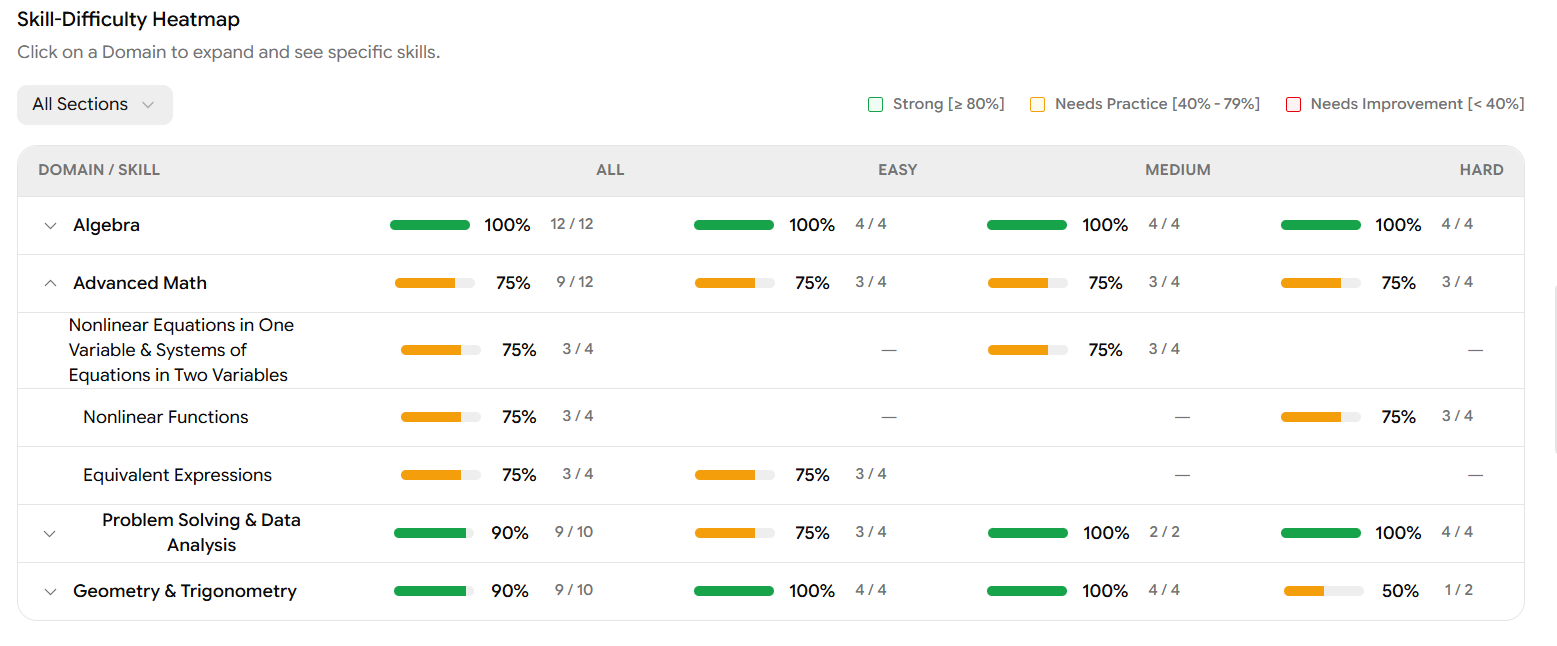
You can also use the All Sections dropdown in the top-left of the heatmap to filter the view by Baseline Section or Adaptive Upper module.
Step 10: Performance by Time (Section-Level)
The Performance by Time chart on the Math tab (and Reading & Writing tab) is scoped to the questions in that section only for Math, this typically spans questions q55 through q98.
There are two chart views available:
Time Pacing Chart (default view)
This chart plots each question on the vertical axis (q55 to q98) and shows when during the test session each question was answered. A dot represents each question green for Correct, red for Incorrect. You can hover over any dot to see the exact question number, the start time within the session (e.g., "Start: 2.96 min"), and the duration spent on it (e.g., "Duration: 2s").
Time Chart (bar chart view)
Click Time Chart in the top-right to switch to a bar chart view. This shows the time spent on each individual question as a vertical bar, with a blue line overlaid showing the average time across all students for each question. Bars are colour-coded — green for Correct, red for Incorrect, orange for Skipped.
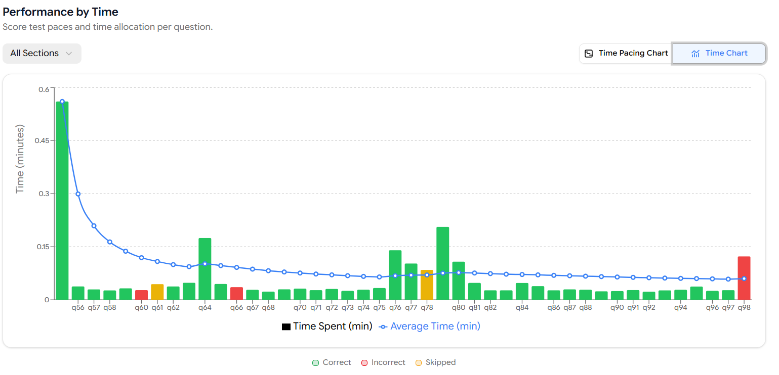
This view is especially useful for identifying outlier questions where the student spent significantly more or less time than average.
The Reading & Writing section has its own identical Performance by Time chart, scoped to the questions within that section.
Step 11: Student Response Review
Click the Student Response Review tab at the top of the report. This tab gives you a complete question-by-question breakdown of how the student responded to every question in the test.
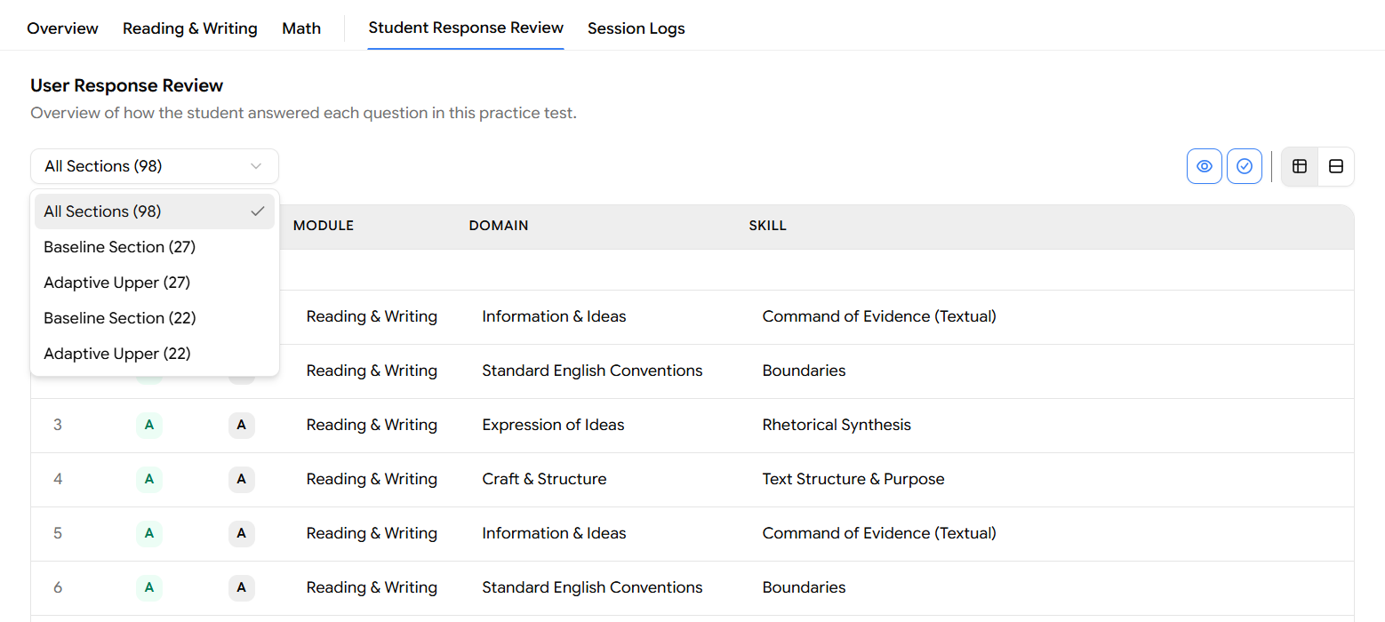
Filtering by Section
Use the section dropdown (top-left, defaults to "All Sections - 98") to narrow the view to a specific module:
Filter Option | What it shows |
|---|---|
All Sections (98) | All questions across the full test |
Baseline Section (27) | The first R&W module (Reading & Writing) |
Adaptive Upper (27) | The upper-difficulty R&W module |
Baseline Section (22) | The first Math module |
Adaptive Upper (22) | The upper-difficulty Math module |
The first two Baseline/Adaptive Upper entries belong to Reading & Writing, and the second pair belongs to Math.
Table Columns
The default table view displays each question with:

# – Question number
Response – The answer the student selected
Answer – The correct answer
Module – Reading & Writing or Math
Domain – e.g., Information & Ideas, Algebra
Skill – e.g., Command of Evidence (Textual), Boundaries
Expanding Additional Columns
Use the column toggle icons in the top-right of the table to show or hide extra columns:

Eye icon – Toggles visibility of question content
Checkmark icon – Toggles answer correctness indicators
Type & Difficulty columns – Shows question type (e.g., Multiple Choice) and difficulty level (Easy / Medium / Hard)
Step 12: Detailed Question-by-Question Review
For a more in-depth look at individual questions, switch to the detailed card view by clicking the expand/card layout icon (the last icon in the top-right icon cluster highlighted in red in the screenshot).
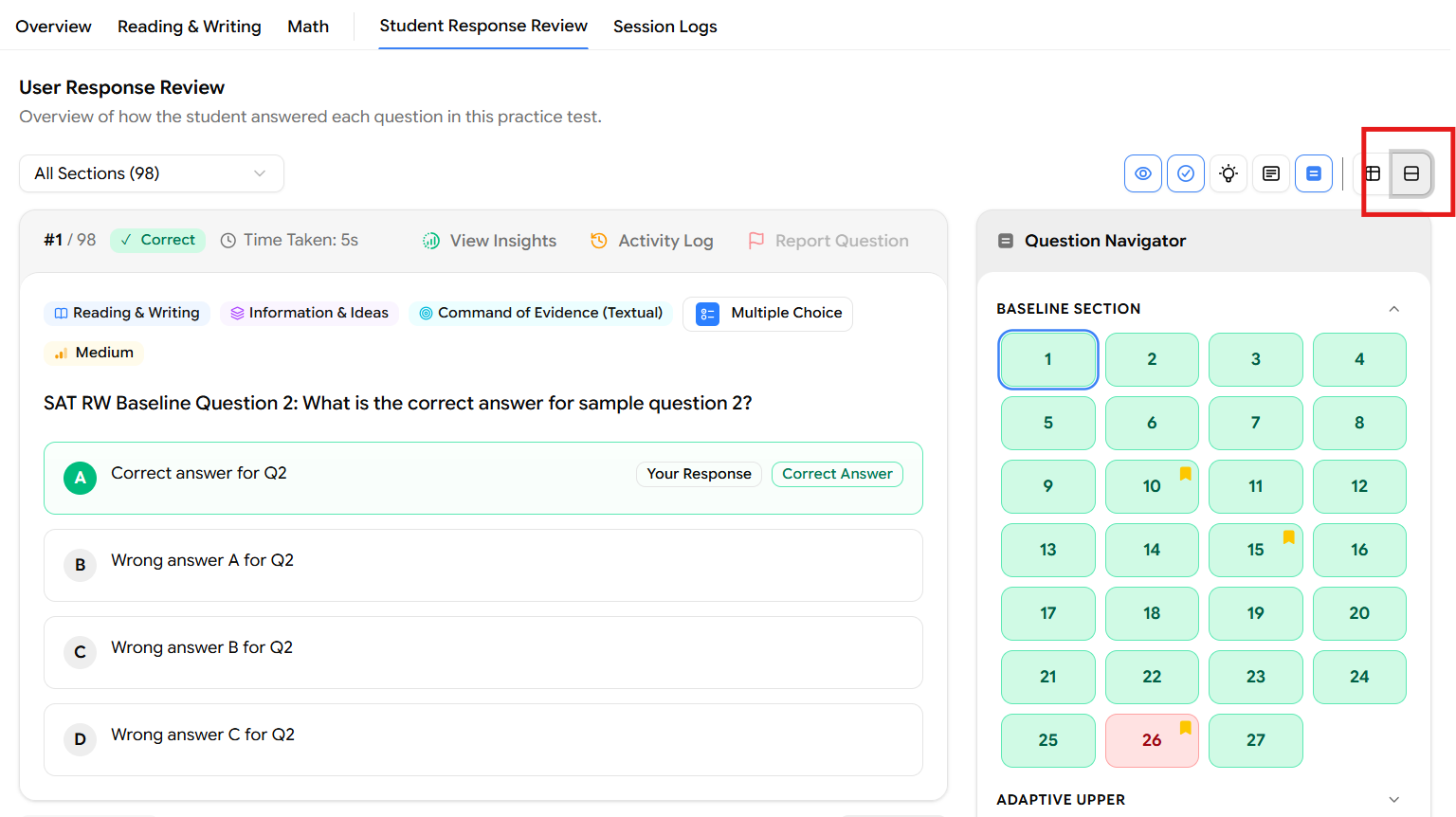
In this view, each question is displayed as an expanded card showing:
Question number and its position within the section (e.g., #28 / 27)
Result badge shows Correct or Incorrect (with a green checkmark or red cross)
Time Taken for that specific question (e.g., 15s)
Question tags: Module, Domain, Skill, Question Type, and Difficulty level
Tools used: Any in-test tools the student used (e.g., Answer Eliminator)
Full question text
All answer options, with the student's selected response highlighted and labelled Your Response, and the correct answer marked Correct Answer
Each question card has three action buttons in the top-right corner: View Insights, Activity Log, and Report Question.
Question Navigator
On the right side of the detailed card view, a Question Navigator panel is always visible. It shows every question in the selected section as a numbered tile, colour-coded by result:
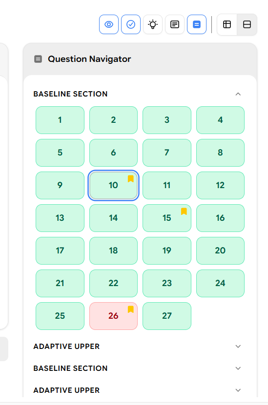
Green tile – Correct answer
Pink/Red tile – Incorrect answer
Orange flag icon on a tile – The student flagged that question for review during the test
You can click any tile to jump directly to that question's card. The navigator is also grouped by module for example, Baseline Section questions are listed first, followed by Adaptive Upper questions below.
Step 13: View Insights
Clicking View Insights on any question card expands a green Insights panel directly below the question tags. This panel shows aggregated data across all students who have attempted the same question giving you useful context to benchmark the student's performance.
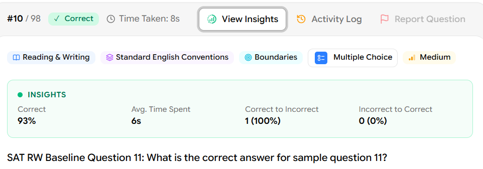
The Insights panel displays four metrics:
Metric | What it shows |
|---|---|
Correct | The percentage of all students who answered this question correctly (e.g., 93%) |
Avg. Time Spent | The average time all students spent on this question (e.g., 6s) |
Correct to Incorrect | How many students changed their answer from correct to wrong, shown as a count and percentage (e.g., 1 — 100%) |
Incorrect to Correct | How many students changed their answer from wrong to correct (e.g., 0 — 0%) |
If the Insights panel shows 93% of students got this question right in an average of 6 seconds, but your student changed their initially correct answer to a wrong one (Correct to Incorrect: 1 - 100%), that is a clear signal to address second-guessing and answer-change habits with the student.
Step 14: Activity Log
Clicking Activity Log on any question card opens a timestamped log panel on the right side of the card. This log records every single action the student took on that specific question during the test, in the exact order it happened.
Each log entry shows the event name and the exact date and time it occurred (down to the second).
Common events you will see in the Activity Log:
Event | What it means |
|---|---|
Landed on Question | The student navigated to this question for the first time |
Marked for review | The student clicked the flag/bookmark icon to mark the question for later |
Answer updated | The student selected or changed their answer (shows which option, e.g., Option A) |
Question left | The student navigated away from this question |
Navigated next | The student clicked the Next button to move to the following question |
Question revisited | The student came back to this question after having left it |
The Activity Log for Question #10 shows the student landed on it at 21:08:13, immediately marked it for review at 21:08:14, selected Option A at 21:08:15, left at 21:08:16, navigated next at 21:08:16, then revisited at 21:08:17 before leaving again at 21:08:22. This tells you the student was uncertain about this question, revisited it, but ultimately kept their original answer.
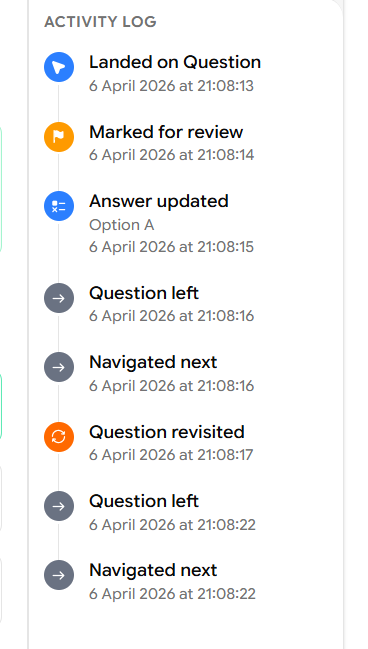
This level of detail is invaluable for understanding a student's test-taking behaviour and decision-making process not just whether they got a question right, but how they arrived at their answer.
Step 15: Session Logs
The final tab in the report is Session Logs. Click it at the top of the report to access the complete activity trail for the entire test attempt not just individual questions, but everything that happened during the session from start to finish.
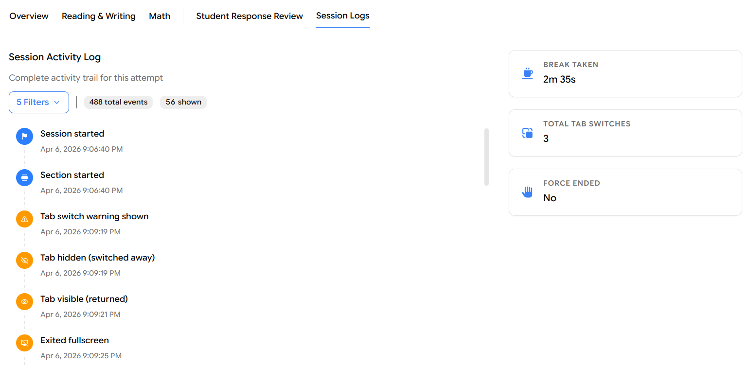
Session Activity Log
The main panel on the left shows a chronological feed of every event in the session, with the event name and exact timestamp. You can see:
Session started – When the student launched the test
Section started – When each module began
Tab switch warning shown – When the system warned the student for switching browser tabs
Tab hidden (switched away) – When the student actually left the test tab
Tab visible (returned) – When the student came back to the test tab
Exited fullscreen – When the student left fullscreen mode
Fullscreen warning shown – When the system prompted the student to return to fullscreen
By default, the log shows a filtered subset of events. The counter at the top displays the total number of events recorded and how many are currently visible (e.g., 488 total events — 56 shown).
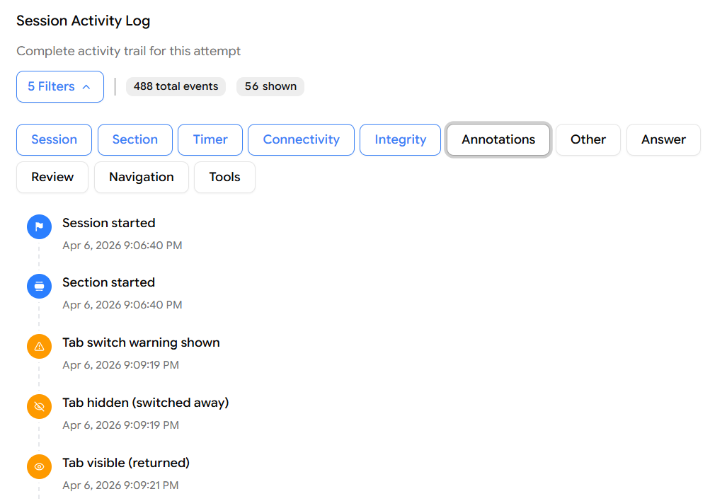
Filtering the Session Log
Click the Filters button (showing the number of active filters, e.g., "5 Filters") to expand the filter toggle. You can turn individual event categories on or off to focus on what matters:
Filter Category | Events it includes |
|---|---|
Session | Session started, session ended |
Section | Section started, section ended |
Timer | Timer events, time warnings |
Connectivity | Network drops, reconnections |
Integrity | Tab switches, fullscreen exits, warnings |
Annotations | Highlights and notes the student made |
Other | Miscellaneous system events |
Answer | Every time the student selected or changed an answer |
Review | Questions flagged or revisited for review |
Navigation | Every question the student navigated to |
Tools | In-test tools used (e.g., calculator, answer eliminator) |
Active filters are shown in blue; inactive ones appear in grey. Toggle any category to include or exclude those events from the log.
Session Summary Cards
On the right side of the Session Logs tab, three summary cards give you a quick overview of notable session-level behaviour:
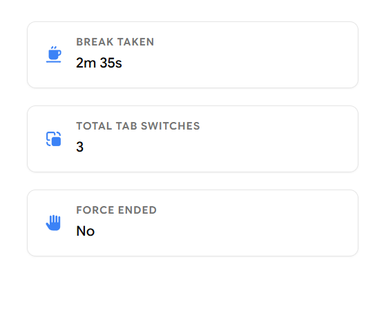
Card | What it shows |
|---|---|
Break Taken | Total time the student spent on breaks during the test (e.g., 2m 35s) |
Total Tab Switches | Number of times the student switched away from the test tab (e.g., 3) |
Force Ended | Whether the test was force-ended by an admin or the system (e.g., No) |
Tab switches and fullscreen exits are integrity signals. A high number of tab switches may indicate the student was looking up answers or got distracted. The Force Ended card confirms whether the student completed the test on their own or had it terminated externally.
That covers every section of the student practice test report in EdisonOS from the top-level score summary all the way through to the session-level activity trail. Together, these reports give you a complete picture of not just how a student performed, but how they approached the test.
Summary of the Full Report Flow
Reports → Select Practice Test tab → (Optional: Apply Filters) → Click View Report → Overview: Score Summary → Section Breakdown (R&W + Math) → Answer Changes → Performance by Difficulty → Performance by Time → Click Math or Reading & Writing tab → Section Score + Accuracy + Time → Score Breakdown by Module → Performance by Difficulty (section-level) → Skill-Difficulty Heatmap → Performance by Time (section-level) → Student Response Review → Filter by Section → Detailed Question-by-Question Card View → View Insights (per question) → Activity Log (per question) → Session Logs (full session trail)